Figma File: Open Surabaya.go.id design in Figma →
A city government portal has to serve two very different audiences at once: citizens looking for services and information, and analysts/officials who need granular, kecamatan- and kelurahan-level data to make decisions. Designing both experiences under one visual system — without one drowning out the other — was the core challenge of this project.
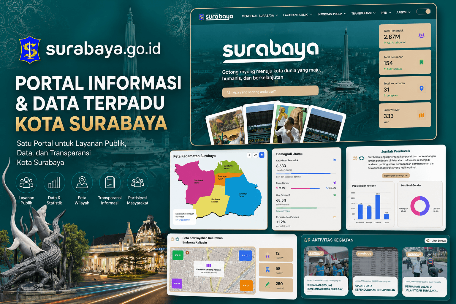
Surabaya.go.id is the official portal of the City of Surabaya, redesigned to bring together the public-facing homepage (services, city profile, transparency) with a data-rich regional dashboard that drills down from city-wide statistics to individual kelurahan (village-level) demographics.
The Figma design spans three layers of granularity: a warm, editorial homepage introducing the city; a mid-level regional dashboard (interactive kecamatan map, population/education charts); and a deep-dive kelurahan demographic page with filterable categories (gender, age, education, occupation, religion, marital status, household head data).
This article walks through the design process: layout strategy across granularity levels, the data-visualization component system, and the color/typography choices that keep dense data legible.
+----------------------+     +------------------------+     +------------------------+
|   City Homepage       |     |   Regional Dashboard    |     |   Kelurahan Dashboard   |
|   (Editorial/Public)  |     |   (Kecamatan-level)      |     |   (Village-level detail)|
|                       |     |                         |     |                        |
| Hero + City Identity  |<--->| Interactive Map          |<--->| Sidebar Category Menu  |
| Key Stats (4 cards)   |     | Demografi Utama panel    |     | Gender / Age / Edu      |
| Wilayah Surabaya info |     | Aktivitas Kegiatan feed  |     | Occupation / Religion   |
| Layanan Pemerintah    |     | Peta Kewilayahan (RW/RT) |     | Bar + Donut chart pairs|
+----------------------+     +------------------------+     +------------------------+
         |                          |                              |
         +----------[ Shared Navbar + Design System ]---------------+
Step One: File Structure & Design Organization
Surabaya.go.id - Design File/
├── Cover & Overview
├── Design System
│   ├── Colors & Variables (Teal / Cream / Accent)
│   ├── Typography Scale (Display Serif + Sans body)
│   ├── Spacing & Grid
│   ├── Iconography
│   └── Batik Pattern Overlay
├── Components
│   ├── Navbar (mega menu, toggle switch)
│   ├── Stat Cards (icon + number + trend)
│   ├── Chart Cards (bar, donut, horizontal bar)
│   ├── Interactive Map Widget
│   ├── Activity Feed Card
│   ├── Sidebar Category Menu
│   └── Accessibility Widget
├── Wireframes
│   ├── Homepage (Low-fi)
│   ├── Regional Dashboard (Low-fi)
│   └── Kelurahan Dashboard (Low-fi)
└── High-Fidelity Screens
    ├── Beranda (City Homepage)
    ├── Wilayah & Demografi Utama
    ├── Jumlah Penduduk & Tingkat Pendidikan
    ├── Peta Kewilayahan (RW/RT)
    └── Demografi Kelurahan (Detail)
Grid system:       12-column, 1440px desktop frame
Auto Layout:        Used on stat cards, chart cards, and sidebar menu for content-driven resizing
Variables:           Teal/cream color modes reserved for section backgrounds (dark city sections vs light service sections)
Component variants:  Stat Card (default/highlighted), Chart Card (bar/donut/horizontal-bar), Nav toggle (on/off)
Step Two: Information Architecture & Drill-Down Flow
Beranda (City-wide)
├── Wilayah Surabaya (city stats: population, kelurahan, kecamatan, area)
└── Layanan Pemerintah Kota Surabaya
    ├── Infografis
    ├── Kelurahan/Kecamatan --> Regional Dashboard
    │        ├── Peta Kecamatan Surabaya (interactive)
    │        ├── Demografi Utama (density, gender ratio, productive age)
    │        ├── Jumlah Penduduk (category + gender charts)
    │        ├── Tingkat Pendidikan (pie + bar charts)
    │        └── Peta Kewilayahan (RW/RT breakdown) --> Kelurahan Detail
    │                 └── Demografi Kelurahan [Nama Kelurahan]
    │                          ├── Jenis Kelamin
    │                          ├── Usia
    │                          ├── Pendidikan
    │                          ├── Pekerjaan
    │                          ├── Agama
    │                          ├── Status Perkawinan
    │                          └── Data Kepala Keluarga
    ├── Infrastruktur
    ├── Layanan Masyarakat
    └── Permintaan Data
Design decision: rather than a flat sitemap, the regional and kelurahan dashboards were designed as a zoom metaphor — the interactive map is the literal bridge between levels, so clicking a kecamatan or RW visually "zooms in" instead of navigating to an unrelated page.
- Deep teal hero with a subtle batik-pattern overlay establishes cultural identity without competing with text legibility
- Wordmark treatment: the "surabaya" logotype rendered large and outlined, paired with the tagline "Gotong royong menuju kota dunia yang maju, humanis, dan berkelanjutan"
- Fanned photo cards: five overlapping, slightly rotated photos give the hero a human, documentary feel rather than a stock-photo grid
- Floating white content card: breaks out of the teal hero to introduce "Wilayah Surabaya" with a photo, geographic description, and four stat chips (Total Penduduk, Kelurahan, Kecamatan, Luas Wilayah) — each with an icon and a small trend indicator
- Layanan Pemerintah grid: six icon-led service categories (Infografis, Kelurahan/Kecamatan, Infrastruktur, Layanan Masyarakat, Permintaan Data) on a clean white section, deliberately contrasting the dark hero above it
Wilayah & Demografi Utama (Regional Overview)
- Left: Interactive map — five-color-coded kecamatan regions (Utara, Pusat, Timur, Selatan, Barat) with zoom/refresh/layer controls
- Right: Demografi Utama panel — key metrics (density, gender ratio, productive-age %, population growth) each rendered as a labeled progress bar or split bar, on a warm cream card background
- Below: a white summary card with icon accents (community/data icons) explaining the region in plain language — pairs quantitative and qualitative content for context
- Aktivitas Kegiatan feed: three photo cards with date stamps and headlines, giving the dashboard a "living" feel rather than static data
Jumlah Penduduk & Tingkat Pendidikan (Population & Education)
- Each metric group follows the same intro card -> two chart cards rhythm: a rounded white card explains what the data means, followed by a bar chart and a donut/pie chart side-by-side on cream backgrounds
- Chart pairing strategy: category comparison always paired with a proportion view (e.g. "Populasi per Kategori" bar + "Distribusi Gender" donut) so users get both absolute and relative reads at a glance
- A pill-shaped "[Category] Lainnya ->" button consistently signals more data is one click away, reinforcing the drill-down pattern
Peta Kewilayahan (RW/RT Territory Map)
- Same interactive-map pattern as the kecamatan view, scaled down to RW (neighborhood unit) level with color-coded zones and a searchable sidebar ("Cari Wilayah")
- Potensi Wilayah table: a searchable data table listing kecamatan, kelurahan, RW/RT counts, and a tagged "Potensi" badge (e.g. "Perdagangan & Jasa", "Industri Kecil") — badges use color coding to make economic-potential scanning fast
- Statistik Wilayah row: three large stat cards (Rukun Warga, Rukun Tetangga, Hektar) close the section with headline numbers
Demografi Kelurahan (Kelurahan Detail Dashboard)
- Two-tone hero: teal card containing the kelurahan name in an elegant serif display face, paired with a rounded white summary chip below it
- Persistent left sidebar menu: seven demographic categories (Jenis Kelamin, Usia, Pendidikan, Pekerjaan, Agama, Status Perkawinan, Data Kepala Keluarga) — always visible so users can jump between data cuts without scrolling
- Stat trio + chart pair: for each category, three large colored stat blocks (e.g. Laki-laki / Perempuan / Total) sit above a bar chart and donut chart pairing — the same "absolute + relative" rhythm established at the regional level, now reused at village granularity
Step Four: Component Library
Data Visualization Components
Stat Card
├── Icon (category-colored)
├── Big number
└── Trend/subtext (up arrow percentage or descriptor)

Chart Card
├── Title
├── Chart body (bar / donut / horizontal bar)
└── Legend (inline or below)

Interactive Map Widget
├── Zoom / Refresh / Layer toggle controls
├── Color-coded region polygons
└── Selected-region label callout
| Component | Variants | Used In |
| --------------------- | ---------------------------------------- | -------------------------------------------------------- |
| Stat Chip | Icon + number, with trend arrow | Wilayah Surabaya, Statistik Wilayah |
| Chart Card | Bar, Donut, Horizontal Bar | Jumlah Penduduk, Tingkat Pendidikan, Demografi Kelurahan |
| Info Card | White rounded, icon-flanked paragraph | Every data section's intro |
| Sidebar Category Menu | Active / inactive item | Demografi Kelurahan |
| Data Table Row | With status badge (Potensi) | Peta Kewilayahan |
| Activity Feed Card | Photo + date + headline | Regional dashboard |
| Accessibility Button | Fixed floating icon (light/dark variant) | Global, all screens |
Primary Teal (Dark):   #0B4F4A   -- hero backgrounds, headings on light
Primary Teal (Deep):   #0A3D3A   -- footer/section depth
Accent Cream/Tan:      #E8CFA8   -- data card backgrounds, stat chips
Accent Gold:           #C9A15A   -- CTA outlines, search bar fill
Chart Blue:            #3B5FE0   -- primary chart series (male/category A)
Chart Pink:            #E0508C   -- secondary chart series (female/category B)
Chart Green:           #2FBF71   -- tertiary series, positive trend indicators
Text on Dark:          #F5EFE3   -- headline text on teal backgrounds
Text Primary:          #1F2A28   -- body text on light backgrounds
Surface White:         #FFFFFF   -- floating content cards
The palette deliberately shifts from the PPID portal's cool navy/yellow to a warm teal/cream identity for the main city portal — a distinct sub-brand relationship where each government service keeps its own visual identity while sharing structural design patterns (navbar, card rhythm, accessibility widget).
Display Serif:        48-64px   -- city wordmark, kelurahan name headers (elegant, ceremonial)
Section H2:            28-32px, bold -- "Jumlah Penduduk", "Tingkat Pendidikan"
Body Large:            16px, regular -- descriptive intro cards
Stat Number:            32-40px, bold -- headline figures in stat cards/chips
Label / Chart Text:      12-14px, medium -- chart labels, legends, table cells
A serif display face is reserved specifically for city/kelurahan identity moments (hero wordmark, kelurahan name) to give those instances a formal, ceremonial weight — while everything data-related uses a clean sans-serif for maximum legibility at small chart sizes.
Base unit:          8px
Container width:     1440px desktop
Section padding:      64px vertical (desktop)
Card radius:          16-20px (cream/data cards), 24px (hero content cards)
Map widget radius:    12px
Step Six: Designing for Data Density
- Consistent chart pairing rhythm (bar + donut, absolute + relative) trained users' eyes after the first section, so later sections needed less explanation
- Warm cream backgrounds for data cards on the teal sections soften what would otherwise read as a cold, technical dashboard
- Progressive disclosure via the map — no page tries to show city-wide AND kelurahan-level data at once; the interactive map is the only way to move between scopes, keeping each screen's cognitive load manageable
- Sidebar category menu at the kelurahan level was chosen over tabs specifically because seven categories would overflow a horizontal tab bar on smaller viewports
- All chart cards were designed with fixed data-slot regions (title, chart body, legend) so real chart libraries (e.g. Chart.js, Recharts) can be dropped in without redesigning the card shell
- Map widgets were annotated with expected interaction states (hover region, selected region, zoom controls) for direct handoff to a mapping library (Leaflet/Mapbox) implementation
- Color variables for chart series (blue/pink/green) were defined once in the Design System page so they map cleanly to a shared charting theme config in code
Design → Development Mapping
Designing a city portal that scales from "welcome to Surabaya" down to "here's the male-to-female ratio in one kelurahan" required treating data visualization as a first-class design material, not an afterthought bolted onto a marketing site.
The key lesson from this project: one visual rhythm, reused at every zoom level, is what makes deep data feel navigable instead of overwhelming. The same intro-card-then-chart-pair pattern that introduces city-wide demographics is the exact pattern a citizen sees drilling into their own kelurahan — so no matter how far into the data they go, the interface never asks them to learn something new.