Figma File: Open PPID KOMINFO design in Figma →
Designing a public information portal for a government institution comes with constraints most consumer products don't have: legal disclosure requirements, accessibility mandates, multiple stakeholder groups (citizens, staff, officials), and content that must stay clear and trustworthy rather than flashy.
PPID Surabaya is a public information portal designed for the Pejabat Pengelola Informasi dan Dokumentasi (Public Information and Documentation Officer) of Kota Surabaya — the government body responsible for public information access requests under Indonesian information transparency law (UU KIP No. 14/2008).
The Figma design covers the full citizen-facing experience: from the homepage and institutional profile, through the information catalog (Jenis Informasi), request procedures (Tata Cara Permohonan), to the legal regulation archive — all designed with an accessibility toggle, consistent navigation, and a component system built for reuse across dozens of subpages.
This article walks through the design process: information architecture, component structure, the visual design system, and accessibility decisions.
+----------------------+     +----------------------+     +----------------------+
|   Navigation System  |     |   Page Templates     |     |   Component Library  |
|   (Figma Components) |     |   (Auto Layout)       |     |   (Reusable Elements)|
|                      |     |                      |     |                      |
| Topbar (contact/jam) |<--->| Beranda (Hero)       |<--->| Buttons              |
| Navbar (mega menu)   |     | Profil (Text page)   |     | Cards / List Items   |
| Accessibility Widget |     | Jenis Informasi       |     | Tabs / Filters       |
|                      |     | Tata Cara (Steps)     |     | Badges / Tags        |
+----------------------+     +----------------------+     +----------------------+
         |                          |
         +------[ Figma Pages ]------+
           Wireframe → UI Kit → Hi-Fi
Step One: File Structure & Design Organization
PPID Kota Surabaya - Design File/
├── 🧭 Cover & Overview
├── 🎨 Design System
│   ├── Colors & Variables
│   ├── Typography Scale
│   ├── Spacing & Grid
│   ├── Icons
│   └── Effects (Shadows, Blur)
├── 🧩 Components
│   ├── Navigation (Topbar, Navbar, Mega Menu)
│   ├── Buttons & Badges
│   ├── Cards & List Rows
│   ├── Tabs & Filters
│   ├── Forms & Inputs
│   └── Accessibility Widget
├── 📐 Wireframes
│   ├── Beranda (Low-fi)
│   ├── Profil PPID (Low-fi)
│   └── Layanan Informasi (Low-fi)
└── 🖥️ High-Fidelity Screens
    ├── Beranda
    ├── Seputar PPID
    ├── Jenis Informasi Publik
    ├── Tata Cara Permohonan
    └── Regulasi PPID
Grid system:      12-column, 1600px desktop frame
Auto Layout:       Used on all navbars, cards, and lists for responsive resizing
Variables:          Color modes prepared for light theme (dark mode not in scope)
Component variants: Buttons (primary/outline), Tabs (active/inactive), List rows (default/hover)
Step Two: Information Architecture
Beranda
├── Profil ▾
│   ├── Seputar PPID
│   ├── Visi & Misi
│   ├── Struktur Organisasi
│   └── Regulasi
├── Tata Cara ▾
│   ├── Permohonan Informasi
│   └── Pengajuan Keberatan
├── Layanan Informasi ▾
│   ├── Permohonan Informasi
│   ├── Keberatan Informasi
│   ├── Alasan Keberatan Informasi
│   ├── Laporan Layanan Informasi Publik
│   └── Laporan Akses Informasi Publik
├── Jenis Informasi
│   ├── Berkala
│   ├── Serta-Merta
│   ├── Setiap Saat
│   └── Dikecualikan
├── Web Utama (surabaya.go.id)
└── Satu Data (external link)
Design decision: the four information categories (Berkala, Serta-Merta, Setiap Saat, Dikecualikan) required their own filterable table view rather than separate pages, since users compare across categories often — this became a single tab-and-table component instead of four templates.
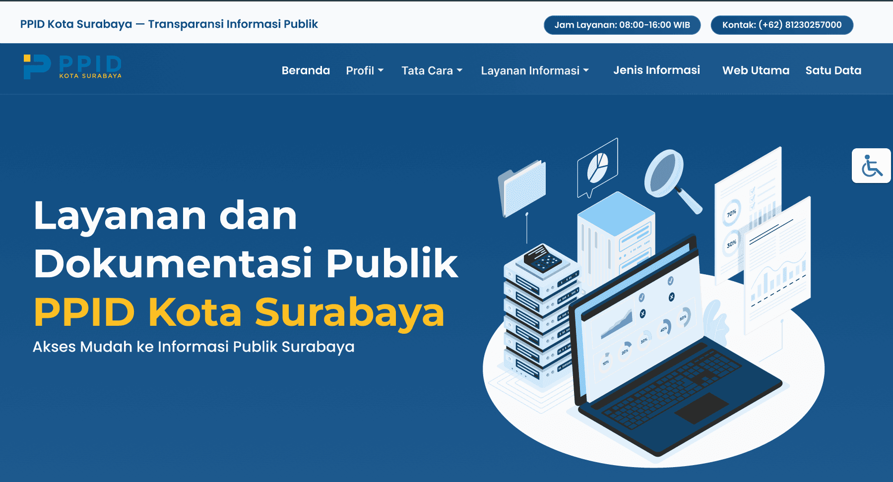
The homepage hero establishes trust and immediate access to the two things citizens need most: contact info and the request flow.
- Topbar: service hours (08:00–16:00 WIB) and contact number, always visible for reassurance
- Hero: two-tone headline (white + accent yellow) pairing institutional identity with the call-to-action tagline "Akses Mudah ke Informasi Publik Surabaya"
- Illustration: isometric data/document illustration reinforces the "information & documentation" theme without needing real photography
- Accessibility widget: persistent floating button, fixed position, available on every screen
A long-form legal/informational text page. Designed with:
- Centered heading + yellow underline accent for section titles (used consistently across all interior pages)
- Justified paragraph blocks for legal text readability
- Max content width (~1100px) to keep line length comfortable for reading
Jenis Informasi Publik (Information Catalog)
- Tab filter component (Berkala / Serta-Merta / Setiap Saat / Dikecualikan) with active-state pill styling
- Two-column table: category label (left, dark blue background) paired with linked sub-items and a "LIHAT" action button (right)
- Alternating row structure keeps dense legal categories scannable
Tata Cara Permohonan Informasi (How-To Guide)
- Illustration of a person accessing the website
- Arrow-connected UI callout showing which menu to click
- Cropped screenshot showing the exact dropdown item to select
This numbered-step + illustration + real UI snippet pattern was designed as a reusable template for other procedural pages (e.g. Pengajuan Keberatan).
Regulasi PPID (Legal Regulation List)
- Card-style rows with law title (left) and a "LIHAT" button (right) linking to the PDF/detail
- Generous vertical spacing and subtle rounded corners to differentiate from the denser Jenis Informasi table
Step Four: Component Library
Topbar
├── Institution label (left)
└── Info pills: Jam Layanan, Kontak (right)

Navbar
├── Logo (PPID mark + wordmark)
├── Primary nav items (7)
│   └── Dropdown variant (Profil, Tata Cara, Layanan Informasi)
└── Sticky behavior on scroll
| Component | Variants | Used In |
| -------------------- | ---------------------------------------------- | -------------------------- |
| Button — Pill | Primary (filled navy), Outline (yellow border) | Hero CTA, Regulasi "LIHAT" |
| Tab Filter | Active / Inactive | Jenis Informasi Publik |
| Table Row | Header / Default | Jenis Informasi Publik |
| Step Badge | Numbered circle (1–3) | Tata Cara pages |
| Accessibility Button | Fixed floating icon | Global, all screens |
| Section Heading | Title + yellow underline + subtitle | All interior pages |
Primary Dark:    #063D6E   — navbar, headings
Primary Blue:    #0B5394   — buttons, links
Primary Light:   #0D5A9E   — gradients, hero background
Accent Yellow:   #FFC94D   — highlights, underlines, outline buttons
Text Primary:    #0F3B61   — body headings
Text Muted:      #5B6F81   — secondary text
Text Light:      #D6E5F1   — text on dark backgrounds
Surface White:   #FFFFFF   — cards, content backgrounds
Surface Gray:    #F5F7FA   — page background
Display / Hero H1:    56px, bold      — homepage headline
Section H2:           40px, bold      — page titles (e.g. "SEPUTAR PPID")
Body Large:           18px, regular   — legal/paragraph text
Body:                 16px, regular   — table content, labels
Label / Button:        14px, semibold  — nav items, buttons, badges
Section titles use an uppercase treatment with a short yellow underline accent — chosen deliberately to signal "this is an official/legal section" without relying on serif fonts, which tested as less accessible on screen.
Base unit:         8px
Container width:   1600px desktop / 1100px content max-width
Section padding:   80px vertical (desktop)
Card radius:       12px
Button radius:     999px (full pill)
Step Six: Accessibility Considerations
- Persistent accessibility widget (wheelchair icon, fixed bottom-right) on every frame, for features like font-size adjustment and contrast toggling once handed to development
- High color contrast between navy/white and yellow accents, checked against WCAG AA for text-on-background pairs
- Large tap targets: all nav dropdowns and buttons sized ≥44px height for touch accessibility
- Consistent, predictable navigation: the same navbar structure and section-heading pattern repeats on every page so screen-reader and low-vision users build a predictable mental model
The Figma file was structured for a smooth developer handoff:
- All screens built with Auto Layout, so resizing behavior is already implied for responsive breakpoints
- Components use Figma variants (not duplicated frames) so devs can inspect state changes (hover, active tab, etc.) directly in Inspect mode
- Redlines and spacing tokens documented on the Design System page rather than scattered per-screen, so implementation (e.g. in an Odoo QWeb frontend) can reference one source of truth
Design → Development Mapping
Designing a government transparency portal is as much an information-architecture problem as a visual one. The real design work happened before the pixels — mapping four legally-defined information categories into one filterable component, and turning dense procedural text into a 3-step visual walkthrough.
The key lesson from this project: consistency is the accessibility feature. A predictable navbar, repeated section-heading pattern, and a small, disciplined component set did more for usability than any single visual flourish — and made the eventual build (in Odoo/QWeb) far more straightforward to implement faithfully.